PROJECT
In late 2023, I was approached by wallpaper brand Deus ex Gardenia to create a palette of five timeless colours for the launch of their exciting, new Grasscloth Collection, created to complement their wallpapers for residential and commercial projects. My aim was to decode a dominant palette that could effortlessly cross-pollinate across the various ranges.
I was particularly excited to work with Katya Nappolini at Deus because we both draw on Italian and English influences for our aesthetic.
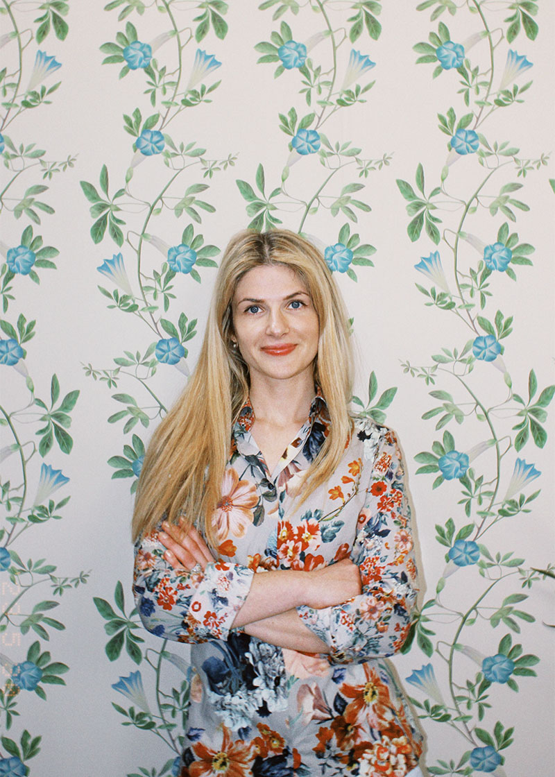
Katya Nappolini, Deus ex Gardenia
Brand history
Deus ex Gardenia, which means ‘God from the garden’, creates beautiful wallcoverings that celebrate the wonder of the natural world, adding botanical glamour to any space.
The brand was established in 2022 by Katya Nappolini, a best-selling luxury textile designer who after studying at Central Saint Martins and spent a decade designing for distinguished names in the world of fashion and interiors, such as Etro, Liberty of London, Ralph Lauren, and Anthropologie. Katya joined force with her husband Marco to help expand the Deus ex Gardenia brand globally and bring her own unique style to the world.
Brand style
The Deus ex Gardenia style pairs the distinctly modern with timeless elegance, layering historical motifs with meticulously hand-illustrated, watercolour and digitally-painted newer visual styles to create one-of-a-kind visual narratives. Katya’s inspiration springs from a treasure trove of botanical sketches and images lovingly gathered over the years. Embracing not only the beauty found in art and faraway lands but also the magic that lies just beyond the doorstep of her home in London, England and Abruzzo, Italy.
Palette observations
Deus ex Gardenia has a sophisticated colour palette of warm, rich and cooler colours that interweave through their designs. Whereas the dominant spectrum of colours in each design offers guidance on obvious colour-ways and combinations, it is the detail within the detail of Katya’s designs that reveal complex and elegant hues.
Working process
As a colour consultant, I am always looking for the relationship between colours and those that could unfold within these relationships. The key to creating a successful palette for Deus ex Gardinia was in finding a consistent harmony across the ranges that also resonated with their brand history, style and ethos — not just colour for colour’s sake. These colours needed to be easy to work with, complex in hue and the correct weight — chroma and value; an essential requirement for ensuring that the colours did not compromise the wallpaper designs. I did not want the colours to dominate, lift or contradict, so it was essential that there was almost an unnoticeable depth to them and that they could be incorporated effortlessly in interior design and commercial projects. It would have been very easy for me to create harmonies that offered a statement or a comfortable clash. The colour ways in the designs offered great scope for this and I found myself visualising rooms painted with these colours alongside the Deus ex Gardinia wallpaper designs.
The initial brief was to create five colours and it very soon became apparent that six were needed. A process of decoding the spectrum of colours took me hours over many days, with each time of day presenting different light conditions to work to in north, east, south and west room aspects. What manifested was a palette bias in the designs of warm tones and hues — hardly surprising given Katya’s innate aesthetic narrative. A palette of five colours was leaving cooler, paler colours unsupported.
Another important factor was ensuring that the colours equally supported lighter, mid and darker tones in the wallpaper designs. And so, it was agreed that six colours comprised of two families (cool and warm) of three hues each would be a better starting point for the Grasscloth Collection. Delving deeper into the relationship between these six colours and the bigger picture, I wanted to ensure that designers and home owners could incorporate the Ggrasscloth Collection and wallpapers into interior design schemes effortlessly with paint colours that they might be working with.
There was a conscious effort to acknowledge the importance of having flexibility to accelerate the colours one direction or another through accompanying paint choices that would enhance the aesthetic and narrative of any scheme using Deus ex Gardinia wall coverings.
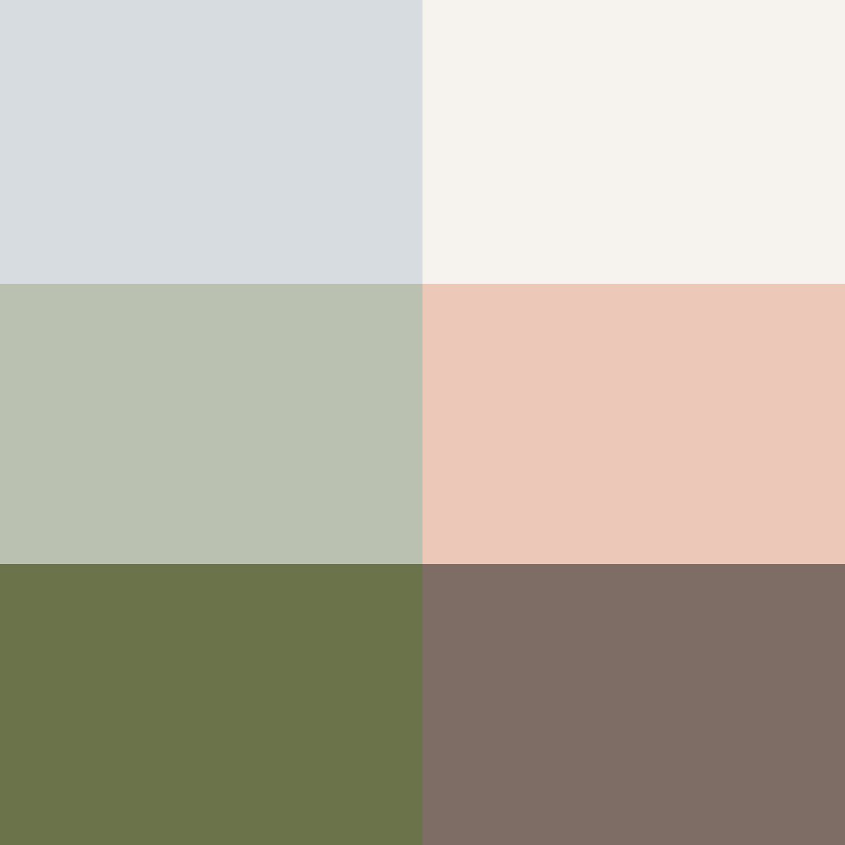
The finished colour palette
Brand materials
The results
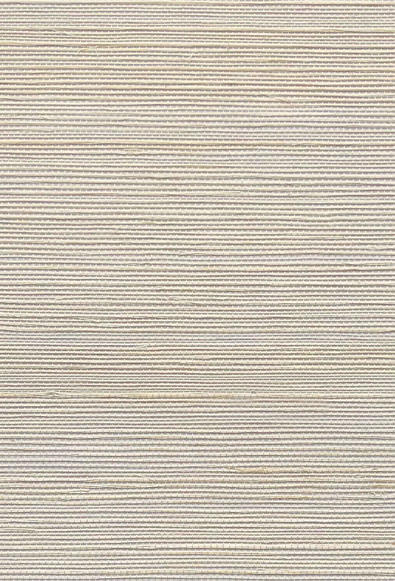
Grasscloth Wallpaper — Complex White
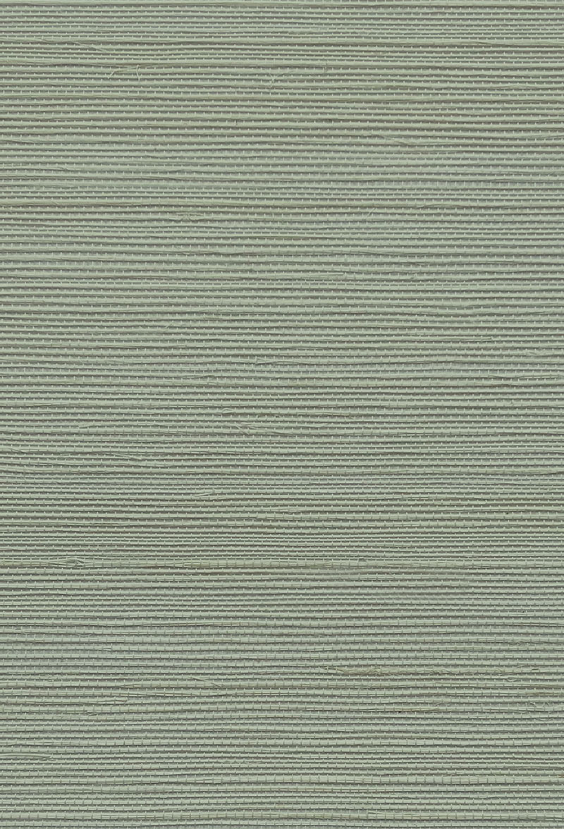
Grasscloth Wallpaper — Earth Green
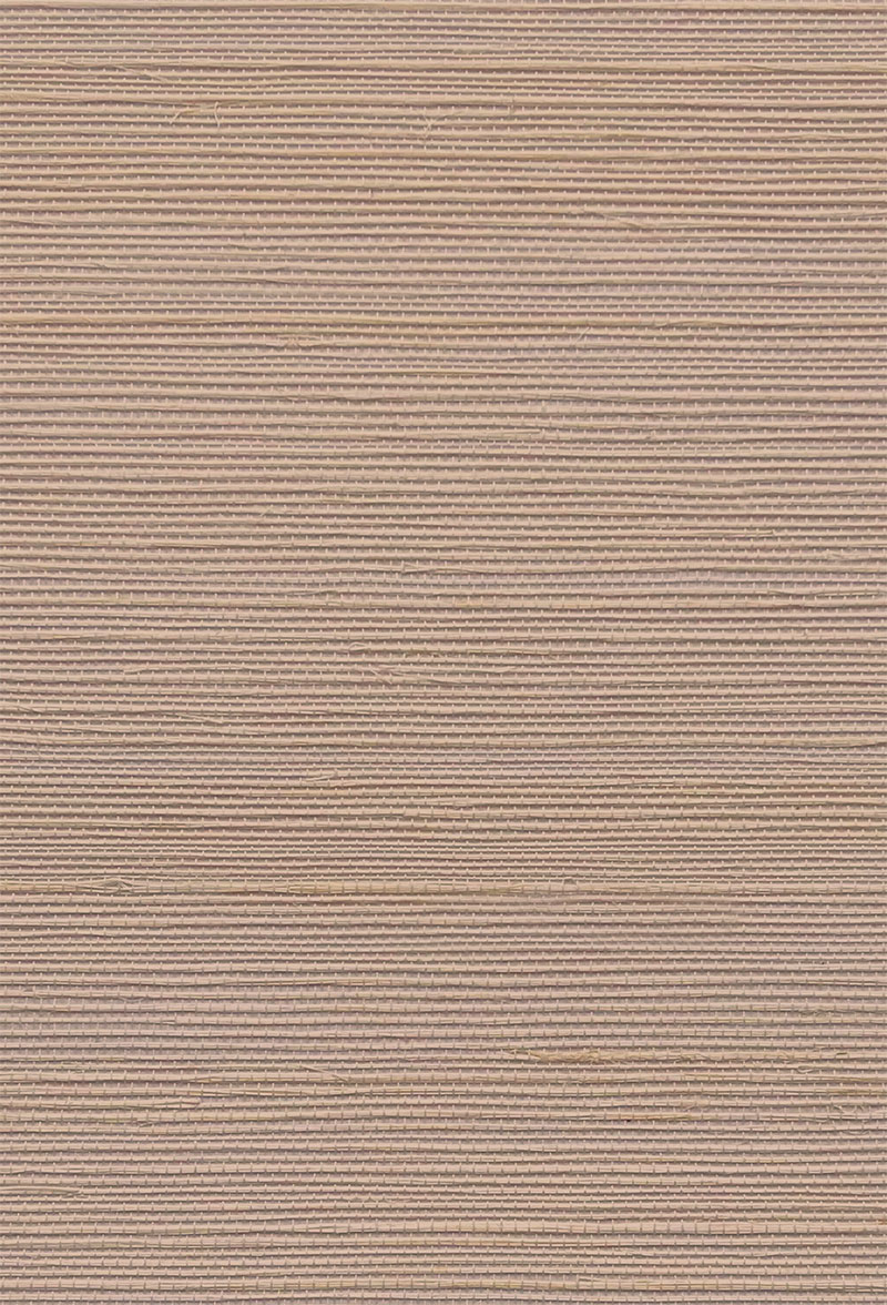
Grasscloth Wallpaper — Peach Sand
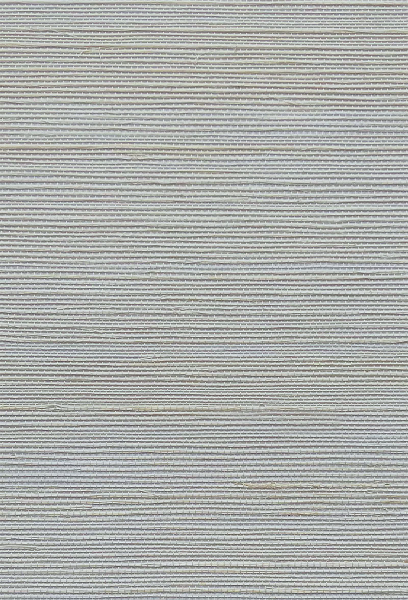
Grasscloth Wallpaper — French Grey
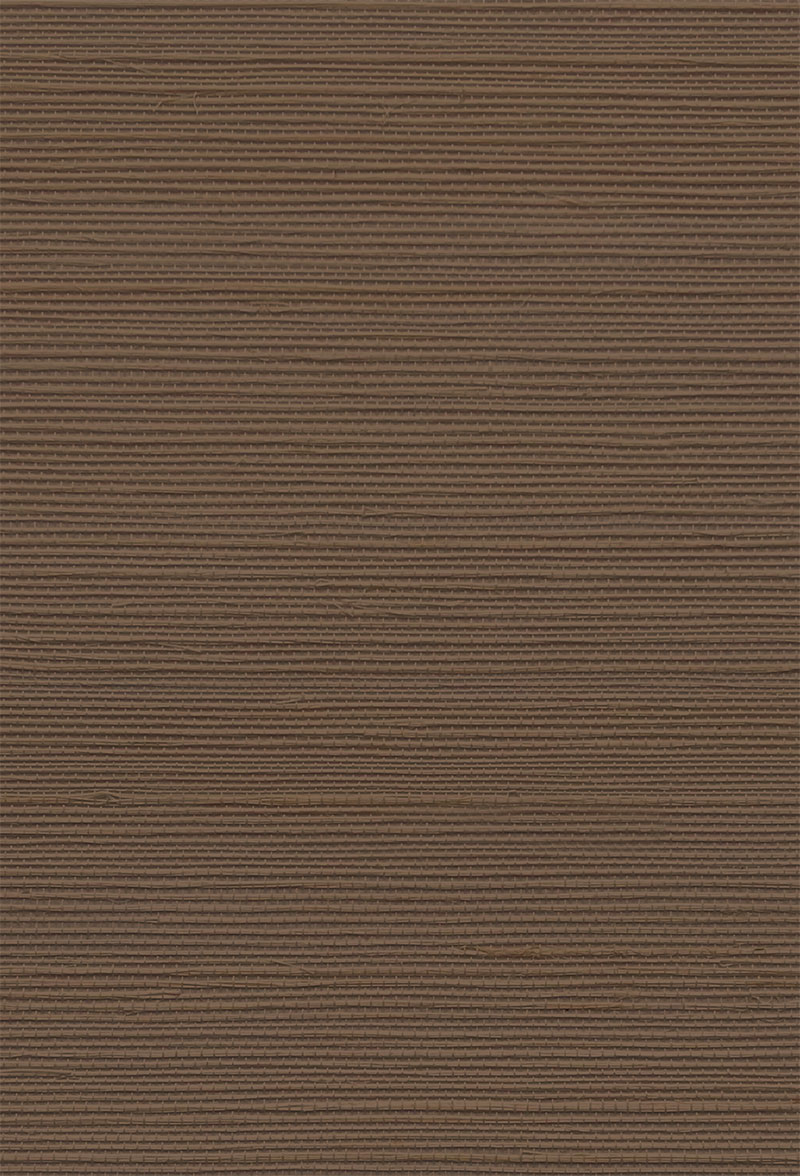
Grasscloth Wallpaper — Brown Stone
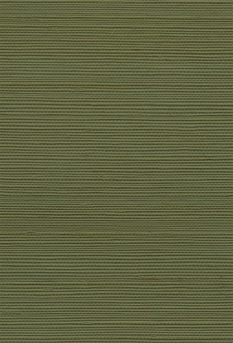
Grasscloth Wallpaper — Treetop
Explore a few of my colour consultancy projects
Book a colour consultation
I’m available for colour consultations at home, online, and for individual or group training.
Please fill in the form, email me or give me a call on +44 (0)7443 429 614